
The causes of this trend seem pretty obvious. Corporate publishers, looking to enhance their bottom lines by producing more and more titles, and trying to capitalize on marketplace crazes (though, really, how many Da Vinci Code knockoffs does the world need?) are prone these days to hasten the draft-to-finished-book process. As a consequence, they’re susceptible to using the same art as others. The fact that they can use identical artwork results from the creation and consolidation of stock photography companies, notably Corbis, Getty Images, and JupiterMedia, which make it easy and relatively cheap for publishers to find high-quality images that designers can use in putting together book covers. Also in the mix here, I suspect, is a calculation by publishers that their readers simply won’t notice that they’re employing the identical book jacket art (or even titles) that others have used before. In the same way as George W. Bush thinks nobody will notice when he says one thing and does another, or companies responsible for failures or tragedies swear they’ll mend their ways but ultimately don’t, so publishers believe that readers have short enough memories that they can duplicate jacket art without public complaints or even awareness.
Wasn’t it William Ralph Inge, the English author-prelate, who said, “Originality is undetected plagiarism”? Of course, what publishers didn’t expect was that some few of us would notice this
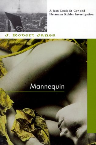
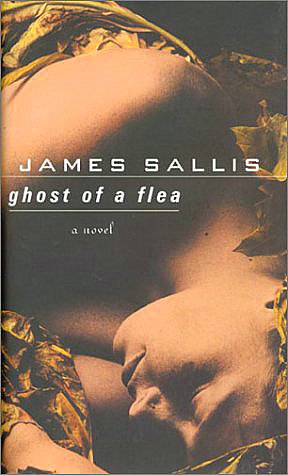 proliferation of copycat covers. In fact, I’ve been keeping a small file on my computer of such book jackets. (Click on each for an enlargement.)
Exhibit A: The cover from a 1999 Soho paperback edition of J. Robert Janes’ Mannequin, alongside the 2001 Walker hardcover edition of James Sallis’ Ghost of a Flea. The jacket photo, taken by Paul Winternitz, is treated only slightly differently on each book.

 Exhibit B: Sometimes book designers will tint stock photos, hoping thereby to create “new” images. That was surely the intent behind the jacket on Forge’s hardcover version of Stuart M. Kaminsky’s Midnight Pass (2003). However, there’s no mistaking its similarity to the shot fronting the Abacus paperback edition of José Carlos Somoza’s The Art of Murder (2004). The photo is Getty stock art by Denis Felix.
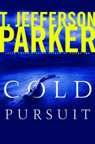
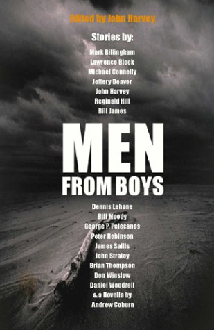 Exhibit C: A similar approach was taken in producing these next two covers. For the Hyperion hardback edition of T. Jefferson Parker’s Cold Pursuit (2003), a photograph of what looks like a large, snaking branch on a beach has been washed over with an electric blue tint that pairs handsomely with the book’s yellow title. Now, contrast that with the same shot, employed on the front of Men from Boys, a 2003 British collection of short crime fiction edited by the award-winning John Harvey. In the latter, the image has been turned slightly so that the branch protrudes from the bottom of the frame, and the sky has taken on an ominous gray that shadows both sand and sea.
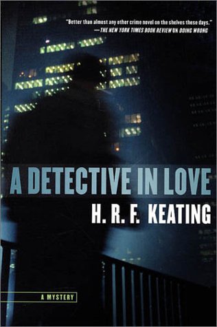 Exhibit D: Another trick is to use only some portion of a full-size image for your cover, hoping that nobody else will do the same. And it’s true, someone cruising fast through a bookstore’s crowded stacks probably wouldn’t realize immediately that the photo fronting the hardback edition of H.R.F. Keating’s A Detective in Love (2002) is the same one from which the original face of Sam Reaves’ Dooley’s Back (2002) was drawn. Note that the indistinct figure hustling along on the left side of Keating’s novel graces the lower-right quadrant of Reaves’ book.
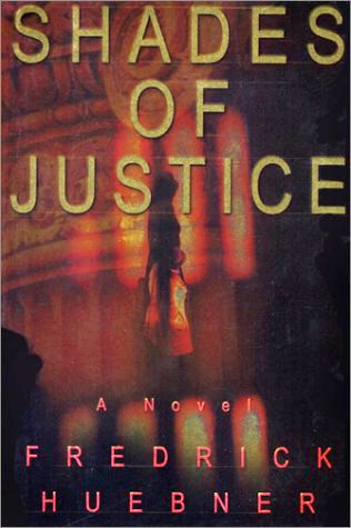 Exhibit E: Cover designers often “flip” photos to lend stock images uniqueness. They might also lighten or darken the original shot. Both techniques were employed to separate the Soho Press hardcover version of Peter Lovesey’s Diamond Dust (2002) from the original, 2001 Simon & Schuster edition of Frederick Huebner’s Shades of Justice. But there’s no mistaking that both began with the same photo by David H. Wells.
 Exhibit F: Overlaying a photograph with text or even another, vaguer image can distinguish one cover from another, too. For the façade of Code to Zero, Ken Follett’s 2000 thriller, publisher Dutton slapped a series of code-suggesting numbers onto a shot later used by Little, Brown for Walter Mosley’s second Fearless Jones novel, Fear Itself (2003).
 Exhibit G: Copycat covers aren’t only found in the crime fiction/mystery section of bookstores, though. Publishers are probably right that there’s considerably less likelihood of consumers noticing duplication if artwork is used on books in different genres, attracting separate audiences. Yet one needn’t try too hard to locate twin covers across category lines. Just compare the jacket from Jim Fusilli’s 2004 Putnam release, Hard, Hard City, with that of Between Two Rivers, a mainstream 2004 novel, written by Nicholas Rinaldi and published by HarperCollins.
 Exhibit H: The latest comparison, in that same vein, might be between the jacket of Ira Berkowitz’s noirish crime novel, Family Matters, released just last month by Justin, Charles & Company, and the front of Seduction, a book about “the aesthetic of erotic femininity,” written by fashion authority Caroline Cox and scheduled for publication (by Collins Design) in the fall.
Now, I don’t live under any fantasy that publishers with more figures in their incomes than I have numbers in my Social Security card will, having been caught out for duplicating covers in this way, reform their behavior. But it’s always good to let them know that those of us who read widely aren’t as oblivious as they think.


6 comments:
Whoa, nice. This is a trend I've noticed, as well. But seeing it laid out in this way is amazing. Great piece!
You might also want to look at Charlie Huston's ALREADY DEAD and the new Serpent's Tail cover for Derek Raymond's HE DIED WITH HIS EYES OPEN. Both of which are remarkably similar.
Here's another one for exhibit D: http://www.amazon.com/Drama-City-George-Pelecanos/dp/0316608211
I loved this piece, and now I always keep an eye out. I know this is genre specific, but it's equally jaw-dropping when non-genre -- i.e. "literature" -- gets separated-at-birth covers. I posted the covers for Jennifer Egan's "The Keep" and Claire Messud's "The Emperor's Children." And both are Knopf books, released in the same month.
This is a great piece. I know this happens a lot, not because I'm an avid reader but because I have worked for both Corbis and Getty Images and I'm very familiar with how the licensing of images like this works. If the publishers want to avoid this from happening, they could always pay a little more for the image and get exclusivity, preventing it from being used by other publishers in the same industry. Still a fascinating trend and great article.
How about these two?
[IMG]http://i43.tinypic.com/2vt1r10.jpg[/IMG]
[IMG]http://i42.tinypic.com/20h4kl0.jpg[/IMG]
Post a Comment