Showing posts with label Cover Themes. Show all posts

Monday, June 17, 2019

Variations on a Theme: Put Your Hands Up!


Monday’s Lie, by Jamie Mason (Gallery, 2015)—selected by Rap Sheet readers as one of the Best Crime Fiction Covers of 2015. After the Eclipse, by Fran Dorricott (Titan UK, 2019).

Sunday, May 05, 2019

Can You Please Just Make Up Your Mind?


Left: Murder Never Knocks, by Mickey Spillane and Max Allan Collins (Titan, 2016). Right: Murder Knocks Twice, by Susanna Calkins (Minotaur, 2019).

Thursday, December 07, 2017

Gifts for December: Bounteous Bennetts


Beware the Curves (Pocket, 1960), by A.A. Fair, aka Erle Stanley Gardner; and The Savage, by Noel Clad (Permabooks, 1959). Artwork on both novels created by Harry Bennett.

American artist-illustrator Harry Bennett (1919-2012), who created some of the most recognizable paperback fronts of the 20th century, is being honored in my book design-oriented blog, Killer Covers, with a month-long succession of posts showcasing some of his best work. As I explain in the introduction to that series,
The paintings he produced for U.S. publishers ranging from Permabooks and Pocket to Gold Medal and Berkley could be seductive or shocking, ominous or humorous, but they were rarely less than outstanding. During a more than three-decades-long freelance career, Bennett—who passed away just over five years ago, at age 93—created the anterior imagery for everything from detective novels and Gothic romances to Hitchcockian thrillers and tales about amorous young nurses. “Literally millions of people have seen hundreds of paintings by Harry Bennett, but few would know his name,” writes a blogger who calls himself NatureGeezer and lives in Ridgefield, the historic western Connecticut town where Bennett also resided for most of his life. Along with artists such as Robert McGinnis, Mitchell Hooks, Paul Rader, Harry Schaare, Ernest Chiriacka, and Victor Kalin, Bennett made 20th-century paperbacks worth collecting simply for their covers.
Today, Killer Covers celebrates the fourth day of its Bennett tribute by posting a scan of the 1963 Pocket Books edition of Erle Stanley Gardner’s This Is Murder, a book the prolific Gardner originally published in 1935 under the pseudonym Charles J. Kenney. You can keep up with the full series by clicking here.

Wednesday, October 11, 2017

Variations on a Theme: Stormy Forecast


Damage Control, by Denise Hamilton (Scribner, 2011); The Stolen Marriage, by Diane Chamberlain (St. Martin’s Press, 2017).

Tuesday, September 05, 2017

Variations on a Theme: Trailer, Parked


A Nasty Piece of Work, by Robert Littell (Thomas Dunne, 2013); Double Wide, by Leo W. Banks (Brash, 2017).

Friday, August 25, 2017

This Should Turn a Few Heads

What may be the biggest themed paperback gallery I’ve ever posted went up today in my Killer Coves blog. It offers 106 book fronts “on which women bare or prepare to bare their assets to men (and occasionally other women), either voluntarily or not, and with varying responses.” You can enjoy the whole set here.

Monday, January 23, 2017

Fatal Fashion Favorites


Terror in Taffeta, by Marla Cooper (Minotaur, 2016); Target in Taffeta, by Ben Benson (Bantam, 1955).

Tuesday, October 11, 2016

Variations on a Theme: Look Out, London!


By Gaslight, by Steven Price (Farrar, Straus and Giroux, 2016); The Jekyll Revelation, by Robert Masello (47North, 2016)

READ MORE:Grit and Literary Grace Drive This Victorian Suspense Yarn,” by J. Kingston Pierce (Kirkus Reviews).

Wednesday, May 14, 2008

Pay Attention, Big Boy!

It’s pleasant to think that book designers and cover artists are endlessly imaginative, that they can produce an ever-expanding array of new and novel covers, each demonstrating a radical departure from what has come before. But of course, that’s simply delusional. As we’ve discovered over time, designers of crime novels (and other books) not only borrow cover themes and image arrangements from each other, they too often duplicate stock art that’s been used prominently on other jackets. As is true of writers as well, designers try to do the best they can, and hope no one notices when they fall short of the heights of genius.

Besides, some ideas just keep on working. Again and again. And again. I was reminded of this recently, when I received in the mail an advance reading copy of The First Quarry, Max Allan Collins’ forthcoming (in October) prequel to his long-running series featuring a hired-killer known as Quarry. The jacket (at right), illustrated by Ken Laager, shows a man seated on a couch (presumably the aforementioned assassin), holding what looks to be a gun, while a curvaceous brunette stands in front of him, quietly but seductively removing her brassiere--though he seems too involved in whatever he’s thinking to notice.

This sort of cover illustration--of a sexy female with her back turned to the book buyer, displaying her virtues to some man (or in one case below, a woman) who is either surprised or distracted by other matters--has become something of a standard. Looking around the Web, I found a number of other similar examples:


Understand, this post is not intended as a knock against illustrator Laager; I like his First Quarry artwork. Just consider it confirmation of that old adage about how there are no new ideas in the world.

(Editor’s note: A revised and greatly expanded version of this piece has been posted in the Killer Covers blog.)

Monday, June 11, 2007

Fright Time in the Forests

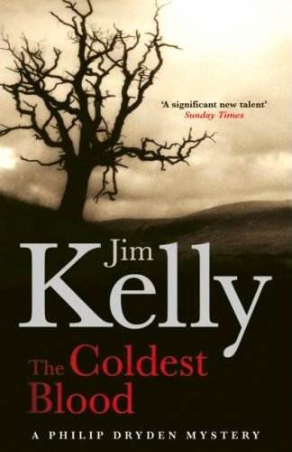
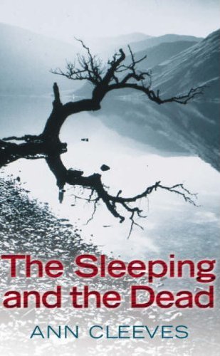
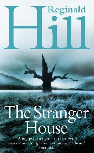
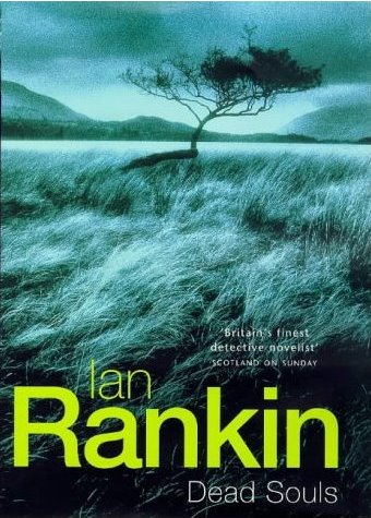
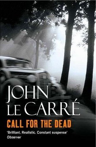
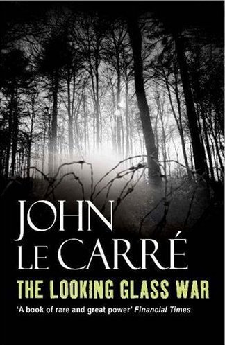
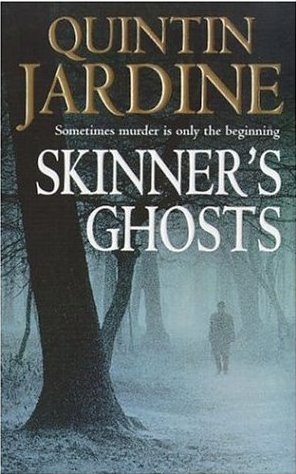
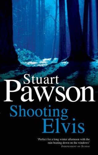
It’s a familiar aphorism, of course, that one shouldn’t judge a book by its cover. Yet there are book designers and graphic artists employed all over the world, hoping that you’ll do just that. They make their living creating interesting, provocative, sometimes bewildering, and--they hope--saleable jackets for novels and works of non-fiction. Some of these fronts are considerably more interesting than others. Some duplicate imagery, as I’ve pointed out several times before in The Rap Sheet, while others tend to duplicate the arrangement of those images. And then there are those jackets that either through disregard or intention repeat graphic themes.

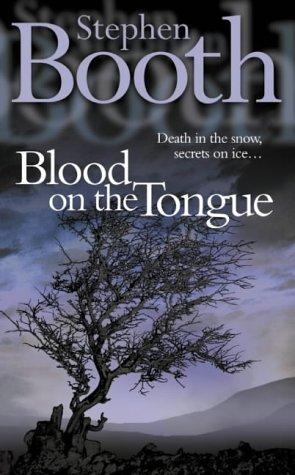
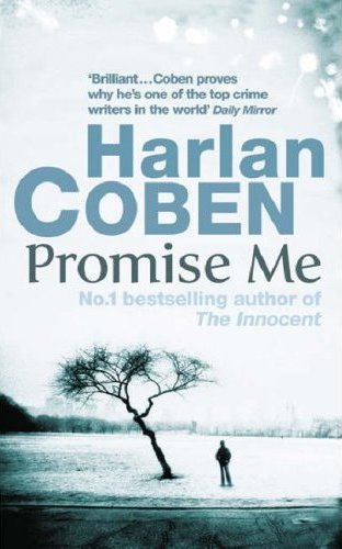
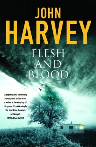
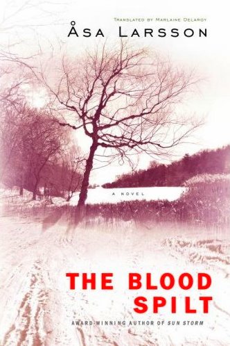
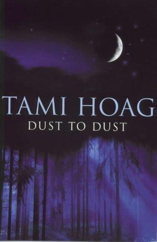
A few months ago, Euro Crime’s Karen Meek pointed out in her blog a remarkable consistency between the jackets of two then-recently published British crime novels: Lesley Horton’s The Hollow Cure and M. Herron’s Why We Die. Both covers are blue in shading; but more important is that the two fronts boast trees, as if some market researcher had determined that trees--if featured in spooky configurations on the covers of crime and mystery novels--could provoke increased sales.

One wonders if this might not be true. Setting aside that minority of the population who actually suffer from hylophobia, or fear of trees, many of us grew up with listening to malevolent lore about forests and their many-branched inhabitants. The Brothers Grimm’s Hansel and Gretel, you’ll remember, were led into a nearby forest and abandoned there by their poor woodcutter father, only to be ensnared by a cannibalistic witch. Little Red Riding Hood was accosted by the Big Bad Wolf while traipsing through the woods, bound for her grandmother’s house. Trolls were once said to inhabit forests, as were hobgoblins and witches, not to mention more conventionally frightening creatures such as snakes, spiders, and bats. Over the last few decades, stories have spread about camera-shy, hirsute hominids (Bigfoot or Sasquatch) haunting the more remote forests of America’s Pacific Northwest. And if all that isn’t enough to put a fright in your spine, The Blair Witch Project, a low-budget 1999 movie that follows a trio of young filmmakers on the trail of that eponymous local legend, might cure you forever of casual forest explorations. Or even too-close contact with arboretums.
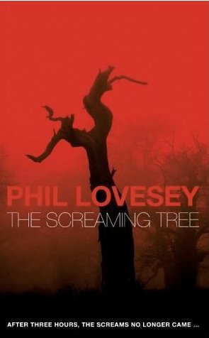
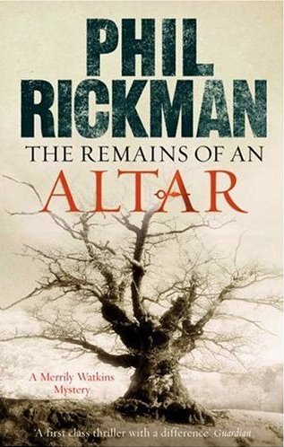
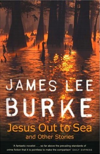
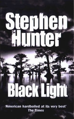
It should hardly be surprising, then, to discover that art directors--looking for mood-setting images with which to front crime novels--gravitate on occasion to tree photographs. (We are, after all, attracted by many of the same things that frighten us, and that can include the evergreen and deciduous denizens of modern forests.) However, trees actually show up more than occasionally on crime novels these days--and not only on releases such as Harlan Coben’s latest book, The Woods, or Michael Connelly’s Echo Park (2006), which might logically justify their being used on the covers. They’re particularly prevalent on releases from Great Britain, as I began to notice after reading Meek’s aforementioned post.

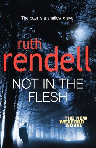
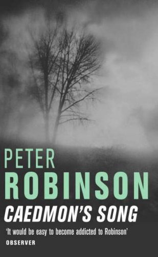
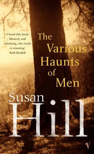
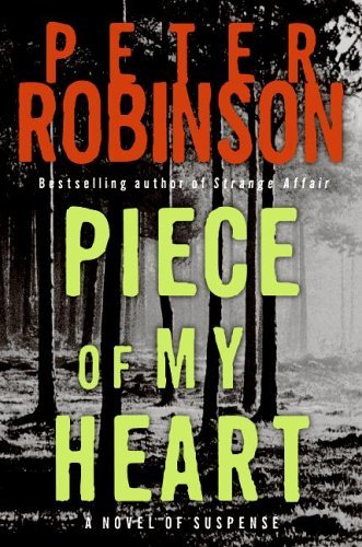
It seems that we can break down the ubiquity of trees as they’re employed on novel fronts into four basic categories. In the first case, these long-living plant forms are used more of less anthropomorphically--that is, as stand-ins for human-like monsters. In the examples shown below, the trees are like many-armed ogres or giants, rising threateningly from a near distance:


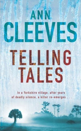
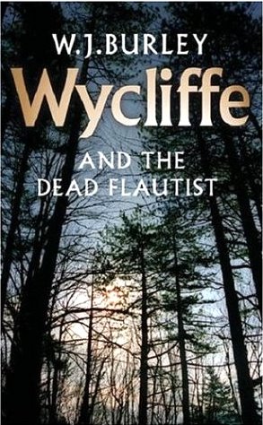
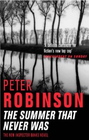
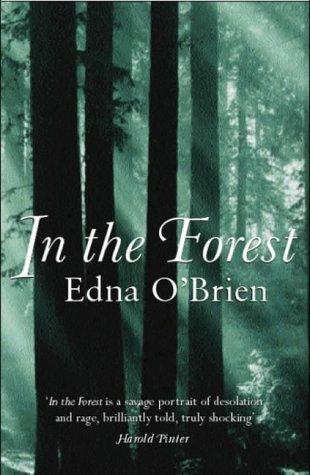
However, tree fronts are also used on crime novels to establish a sense of desolation and bleakness, or mystery, which is well associated with this genre. These covers often find the tree, or trees, looking quite forlorn and innocent--like sitting ducks:


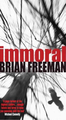
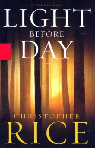
Beyond that there are the ominous-looking tree fronts--those on which the bark-encased stars loom belligerently overhead like villains preparing to fall upon and do violence to their victims:


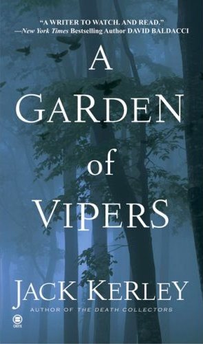
Concluding our display, we have the tree photos that are meant simply to convey a mysterious atmosphere. These jackets often include fog or snow, a nighttime sky or--in two of the examples shown below--swamps that engulf the trees’ roots:


Any number of poets and others have championed trees over the centuries. Wasn’t it German theologian Martin Luther who said, “For in the true nature of things, if we rightly consider, every green tree is far more glorious than if it were made of gold and silver”? And it was certainly Bengali poet Rabindranath Tagore who wrote, “Trees are the earth’s endless effort to speak to the listening heaven.” These stately plants can be beautifully imposing. They also help replenish the earth’s oxygen supply and reduce carbon dioxide in the atmosphere, as environment-conscious former U.S. Vice President Al Gore has been quick to remind us.

However, the designers of crime novels--like the storytellers who wanted to warn children off from wandering into the deep woods--have sought to associate trees with danger, disorientation, and despondency, all in the interests of book sales. One wonders whether this is healthy for the future of forests, a rapidly dwindling resource--or even healthy for the future of mankind, which might also become a dwindling resource. Should these designers pay some heed to that famous 1970s TV commercial slogan, “It’s not nice to fool with Mother Nature”? Perhaps it’s time to find a new way of communicating fright and suspense to readers. Trees have borne that burden long enough. Dare I say, it’s time to branch out?